The best-looking help centers do more than match the company logo. They give customers a clear first move, whether that's searching for an error, browsing by task, or asking for help.
These five public knowledge bases show different ways to do that. Use the screenshots to pick a pattern that fits your customers, or see how to build a branded help center that feels like part of your product.
1. MasonHub: make the help center feel like the product
MasonHub's public help center uses dark surfaces, a restrained pink accent, and headings that sound like the work its customers do. Orders, inventory, and shipping are visible in the navigation. Links for common tasks sit just below the hero, and the contact button stays easy to find.
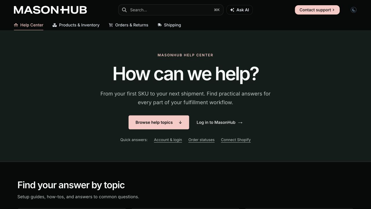
MasonHub Help Center, published with DocsAlot. Desktop capture from November 5, 2026.
Borrow this pattern when: customers return to solve specific problems. Put three common tasks next to the main browse action and label them with the language customers use. Keep the same visual cues as the product so the help center doesn't feel like a separate website.
For a more technical audience, MasonHub's ERP integration playbook shows a different pattern: a sequential path from setup to production. Use task shortcuts for returning support readers and a guided path for an integration with prerequisites.
2. HelpDocs: make search the first action
The HelpDocs public support site opens with a large search field, popular articles, and topic navigation. That is sensible when a visitor already has a question and wants an answer before contacting support. The front page also links to API and contact paths, so search is prominent without becoming a dead end.
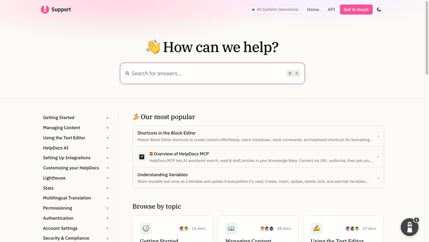
HelpDocs support site, captured October 31, 2026.
Borrow this pattern when: your support team sees many repeat questions with known answers. Put search and the most common tasks up front. Check the queries that return no useful result; those are candidates for new or improved articles.
Do not copy it blindly: a developer who needs an API authentication flow may need a guided quickstart or reference navigation before a search box. An existing help desk can be excellent at support answers without being the best home for every technical guide.
3. Help Scout: make the categories easy to scan
The Help Scout Docs site groups articles around setup, account management, Inbox, Docs, and other parts of the product. The visible contact path is important: readers can try self-service without wondering how to reach the team when an article is not enough. Help Scout's product and pricing pages make clear that Docs is part of a wider inbox and support workflow.
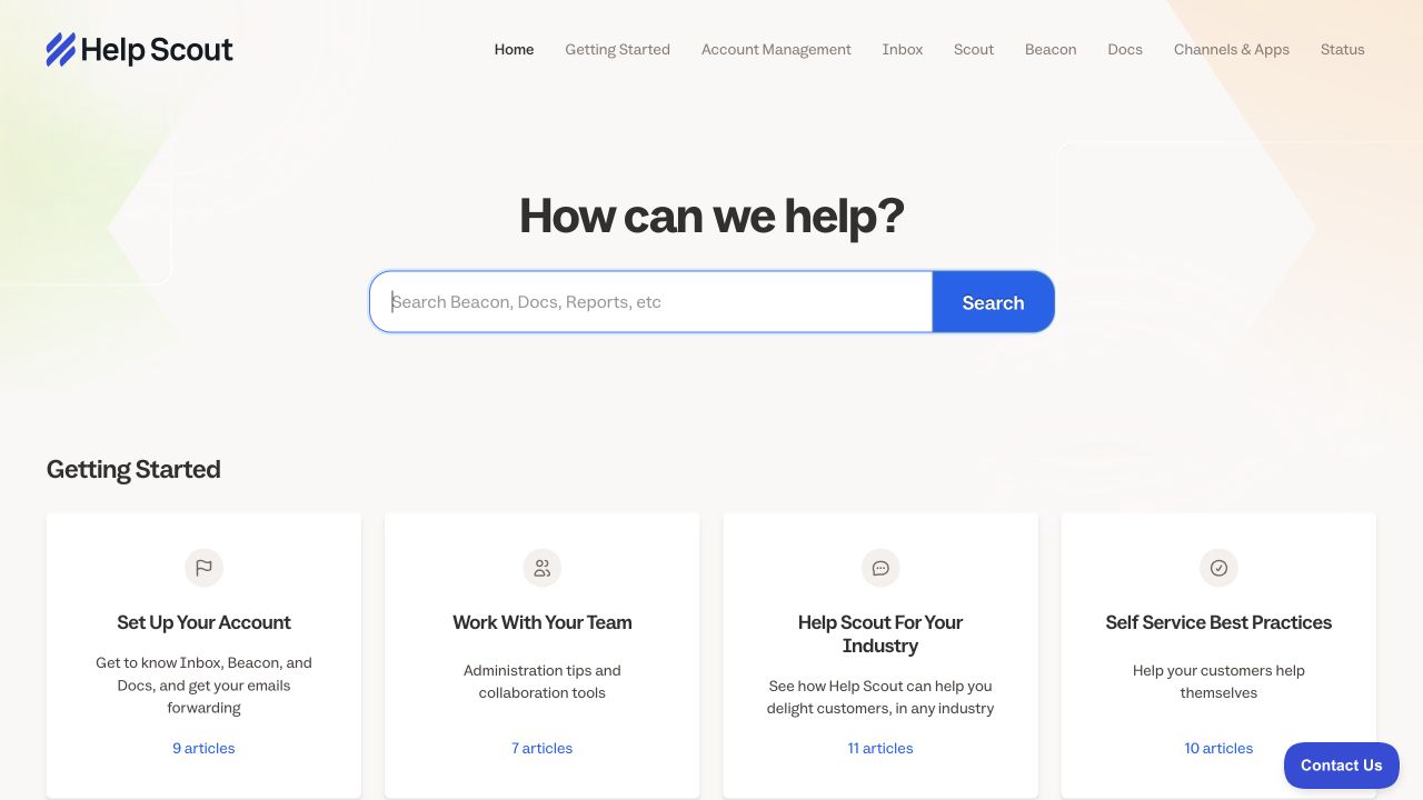
Help Scout's public Docs site. Desktop capture from November 5, 2026.
Borrow this pattern when: the customer might enter through a ticket, chat, widget, or article. Use the same task names in the help center that the team uses in support. A good article should be easy to send in a ticket response, not just easy to find from the home page.
Do not mistake this for ticketing itself: the article answers the reusable question; the inbox still owns assignment, private context, and follow-up. Our help-desk knowledge-base guide lays out that division.
4. Zendesk: offer routes for different kinds of questions
Zendesk's public help center puts search above distinct paths for getting started, product guides, FAQs, and community. Someone setting up the product for the first time doesn't have to start in the same place as someone diagnosing a problem.
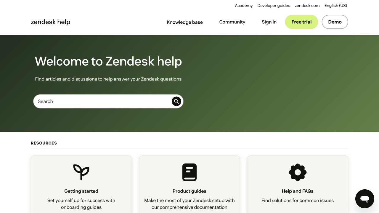
Zendesk's own help center. Desktop capture from November 5, 2026.
Borrow this pattern when: your help center serves people at different stages. Separate onboarding from troubleshooting. Don't copy every category if you only have a few dozen articles.
5. Intercom: use a distinctive visual without burying search
Intercom's public help center uses an illustrated hero, but search stays front and center. Below it, collections give readers a second way in when they don't know the right search term.
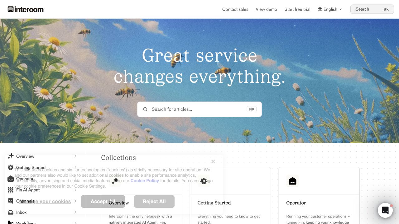
Intercom's own help center. Desktop capture from November 5, 2026.
Borrow this pattern when: brand recognition matters, but customers are there to finish a task. Keep artwork behind the interface, make the search field easy to find, and check that both search and categories are visible on a phone.
What the editor has to support
The published site is only half the experience. If every screenshot update or FAQ addition requires a developer, the knowledge base drifts as the product changes. A useful editor lets the team change the actual article, review it, and publish it without breaking code blocks, links, or navigation. DocsAlot supports visual editing alongside Markdown and technical components.
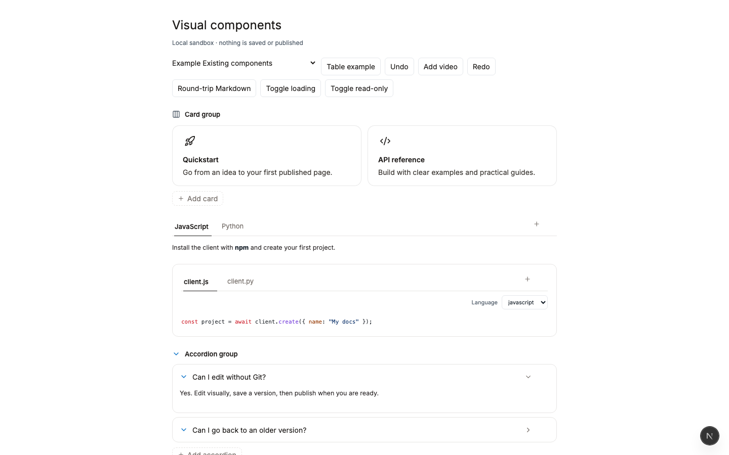
This is a local component sandbox, not MasonHub's workspace or a production editor screenshot. It illustrates the types of blocks available while authoring.
When evaluating a new platform, try rebuilding one of your own pages before making a migration decision. Use a page with a screenshot, a code sample, and a support link. Then compare the draft in the editor to the published mobile and desktop views. The test reveals more than a feature checklist.
If you are leaving HelpDocs, start with our HelpDocs alternatives shortlist or the direct DocsAlot comparison. If you want to improve the public site without moving your inbox, see the branded help center and start by previewing one article in your own brand.